34 Million Americans Receiving Food Assistance – 6 Million Increase in One Year: Five Charts Showing the Status of U.S. Employment: Manufacturing Pounded, Participation Rate at Multi-Decade Lows, Part-time Employment at Record Levels, and Less Layoffs with few Hires.
- 4 Comment
There is something troubling when the theme of recovery is never tied to U.S employment. The American worker is suffering. This has not changed. The solace being offered is that less people are being fired. I suppose the 26 million American workers who are unemployed or underemployed might find some comfort in the jobless recovery talk. Yet this recession is making it particularly hard for people to find work. That is why we are seeing a spike in bankruptcy rates that rival those of 2005 when people rushed to file before more stringent guidelines were imposed. Even with the banking friendly rules, you can only squeeze so much out of someone who has nothing left.
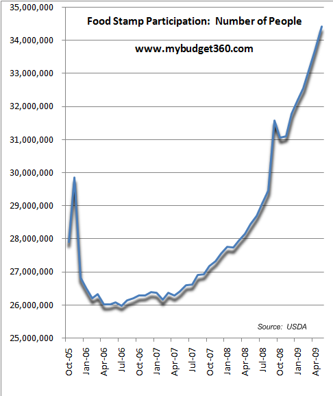
If you want to see the actual pain for those at the lowest rung of the economic ladder, all you need to do is look at the massive spike in people receiving food stamps:
This is off the charts here. We can look at two previous peaks to see how bad this in proportion to the population:
1981:Â Food stamp participation at 21 million
Population (229 million)
9 percent of total population on food stamps
1994:Â Food stamp participation at 27 million
Population (263 million)
10 percent of total population on food stamps
2009:Â Food stamp participation 34 million
Population (307 million)
11 percent of total population on food stamps
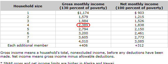
I adjusted the figures to account for population and by far, this is the highest rate of people on food stamps in the last 30 years. And the spike is amazing if you look at the above chart. We went from 28.4 million in May of 2008 to 34.4 million in May of 2009. 6 million people have been added to the food stamp program in the matter of one year. And if you think people receiving this assistance are making big bucks, the average monthly benefit comes in at $101 per person. And if you think these are average Americans (i.e., those making $50,000 a year who are struggling as well) think again:
The program itself is no longer called food stamps but is now labeled as SNAP (Supplemental Nutrition Assistance Program). Bottom line however is that many people are struggling in this economy and those with lower incomes and the middle class are being squeezed the hardest.
With that as the economic back drop, let us now look at the overall employment situation:
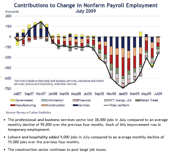
Chart 1 – Sectors of Employment
These are illuminating charts from the Atlanta Federal Reserve. We already know that since December of 2007, the economy has shed nearly 7 million jobs by official standards. But if you look at which sectors have been hit the hardest, you can see why the middle class is being hurt. The biggest hit sectors are manufacturing, construction, and services. Now we need to remember that the manufacturing sector has been decimated over the last 40 years so these jobs being lost are in light of the already deep cuts. Construction employment has fallen with the housing bubble imploding. In the past, we would usually have construction and housing lead us out of recession but this recession was caused by housing and massive amounts of debt. Plus, we have $3 trillion in commercial real estate debt and plenty of empty vacant space for years to come.
These jobs were better paying positions. If you look on the chart above, the only 2 sectors that had any hiring in 2009 on an overall basis to show up on the chart are the government and services. This is not where you want to see job growth.
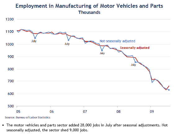
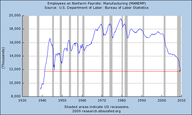
Chart 2 – Manufacturing
At a certain point we are going to need to realize that having some semblance of a manufacturing base is going to be important for the vitality of our country. People may not even realize that we have the same number of people employed in manufacturing as we did back in the 1940s not adjusting for population growth!
These are typically better paying jobs and the pattern is abundantly clear. The employment picture looks grim if we don’t stabilize some of these markets.
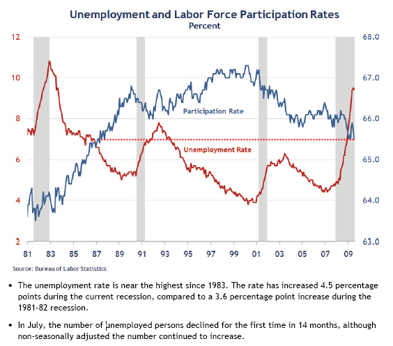
Chart 3 – Unemployment and Participation Rate
We are starring at unemployment rates and labor force participation rates that have not been seen in 30 years. What is troubling regarding this recession is how deep and how quick it is moving. What is even more disturbing is the new structural changes that are occurring. For example, we may not see the fabled 4 to 5 percent ideal unemployment rate for another decade. What industry is going to pick up this massive slack? This is one thing that escapes many. We went from a technology bubble to a housing bubble. This has preoccupied our nation for 20 years. Is there any other bubble to create massive amounts of employment? I just don’t see it occurring in the short-run. I’m looking at indicators like the food stamp participation rate, U-6 employment measures, and following the $3 trillion in commercial real estate debt outstanding. This will give us a better sense of when true recovery occurs and not just a bailout for Wall Street rallying on the subsidies of the American taxpayer.
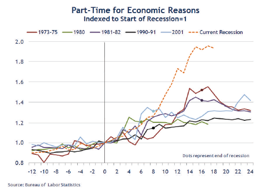
Chart 4 – Part-time for Economic Reasons
Never have we seen this many Americans working part-time for economic reasons. In this way, we are becoming like Japan since they have a high part-time employment base. No security, no benefits, and no stability. Some 8.8 million fall in this category. This pattern is troubling because Japan saw similar impacts once their Heisei bubble burst and caused two (going on three) lost decades. They kept zombie banks alive while bleeding the real employment sector dry. They report low overall unemployment rates but those working part-time make up nearly a third of their entire workforce. We are seeing similar patterns with commercial real estate debt just sitting hidden and the U.S. Treasury and Federal Reserve buying up questionable assets in exchange for U.S. Treasuries.
Now this issue is going to carry a lot of weight especially with the current healthcare debate. Part-time employment growth is not exactly something you want to see.
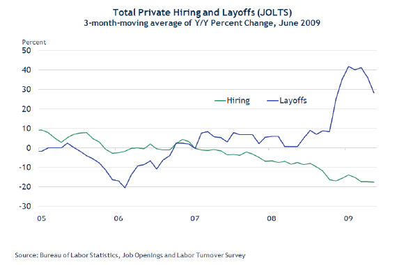
Chart 5 – Less Layoffs but Few Hiring
Chart 5 probably summarizes our current position best. As you can see, the layoff trend is heading lower but the hiring trend is also at a low level. In fact, according to the Atlanta Federal Reserve Board for June of 2009 the hiring rate came in at a record low of 2.9%! This is the lowest on record since data started being measured back in December of 2000.
Now just think about what the above chart signifies. If people aren’t hiring and people are still letting people go, is this actually a good sign? That is why it is premature to say things are getting better. The jobs that were lost were good paying jobs. Many will never return. So what industry is going to make up that gap? If there is no industry, then our economy is going to have to adjust. Sure the S&P 500 is up by 50 percent but this isn’t based on solid earnings. If we look at more realistic indicators of our economy, the recession is still deep and painful and shows no signs of improving, just getting worse at a slower pace.
If you enjoyed this post click here to subscribe to a complete feed and stay up to date with today’s challenging market!4 Comments on this post
Trackbacks
-
jon said:
This is really an excellent blog.
I would what is interesting is that if you compare the total borrowing to the employment charts above we can see that the average American began to increase borrowing when jobs were disappearing to developing countries.
So many people are deluded that we are somehow a wealthy people when really all the apparent wealth is just borrowed money.
I work in the Auto industry and people don’t realize that half of our typical income is now coming from government supported businesses.
The American people truly need to wake up. When the borrowed money disappears so does our standard of living.
August 19th, 2009 at 4:02 am -
Edward said:
It is a shame as Americans are fleeced on a daily basis by their government and the large corporations. There is only so much that a person can borrow before their limit is up. Who is overseeing what the US Government can and is borrowing? Who is going to pay it all back? We have no manufacturing left in the US, which is responsible for leading the US out of past recessions. When will Americans wake up and put a stop to the bailout of billionaires? When will America see true accounting by big corporations? America is in one large bubble which has begun to deflate. What we are doing today is showing utter disrespect for our founding fathers.
Only God can choose to bless and save the USA now.August 19th, 2009 at 10:01 am -
HansL said:
If a country can violate other countries into “democracy” it should not print Foodstamps. If a country can produce the most sophisticated drug to cure people allover the globe for all diseases no one in that country should be without insurance. Your system is insane. Your country needs to be cured. I revolution might be the right medicine.
August 19th, 2009 at 1:25 pm -
bob said:
Thanks for the charts. Therein lies reality that no amount of “green shoots” hype produced by the propaganda machine can hide. Great work!
August 23rd, 2009 at 10:39 am
