The grand financial recovery myth – 8 charts reflecting the true beneficiaries of four years of taxpayer bailouts. Transfer payments make up 22 percent of household income and public debt surpasses annual GDP.
- 4 Comment
While the economy is recovering in raw GDP terms the working and middle class Americans are having a smaller and smaller piece of the pie. The recovery is disproportionately flowing to a tiny fraction in our population and largely is based on targeted bailouts to the financial sector. After four full years of bailouts and transfers to the banking sector it is clear that the inflation of the stock market has occurred only because of government support of failed banks (many who are now reaping profits overseas). This also explains why unemployment is still stubbornly high and each month we keep shattering records for those receiving food stamps. The upcoming decade if we continue down this path may be known as the great middle class swindle. The evidence is rather conclusive that the current safety net resurrected by taxpayers has largely benefitted the same banking system that has led us down this unfortunate financial path. Let us examine 8 charts regarding the current state of the economy.
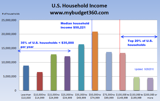
Chart #1 – U.S. household income
U.S. household income is rarely brought up in the press. The reason of course is that household income has gone absolutely nowhere for an entire decade. Instead of focusing on this the media chooses to focus on fleeting stories that have little impact on the daily lives of Americans and serve more as mere sideshows and distractions. While the cost of education, food, fuel, and other daily goods have soared to the stratosphere the wages that pay for these goods has shrunk. Those who were able to stash money away in the stock market have seen practically no returns over the decade. And why would they? The big money to be had is in hedge funds where many make bets on a failing economy and profit handsomely. The buy and hold investors thinks that purchasing a stock is largely a long-term investment and this is what they are conditioned to believe. In reality, you have high frequency traders and hedge funds making billions of dollars on quick trades that have little impact on long-term sustainability and actually create crisis over the long-term. With no income growth, that same paycheck is being eaten up by the cost of more expensive goods and the volatility of the market soars.
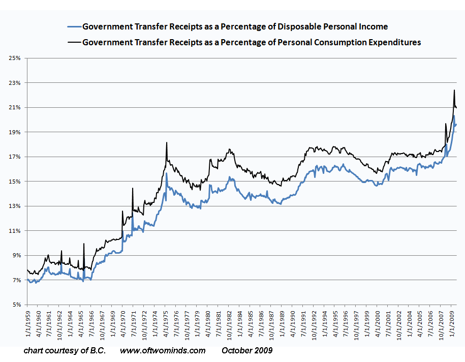
Chart #2 – Transfer payments
Source:Â Of Two Minds
Transfer payments include welfare (financial aid), social security, and other subsidies by the government to certain businesses (i.e., ethanol). I was amazed to see the above chart. Government transfers now make up 22% of household income, a record amount. Keep in mind this is happening at a time when the economy is supposedly recovering. What the above chart is telling us is that more and more people unable to find work in the regular economy are depending on a variety of government payments. Unlike the banks however, who needed taxpayer bailouts to continue financing their yachts and gambling lifestyle many of the above are using the funds to pay for food and basic necessities. The fact that we are reaching a debt ceiling is troubling and we are clearly down an unsupportable road. Bottom line is the money has run out a long time ago and all of this is now being financed on debt.
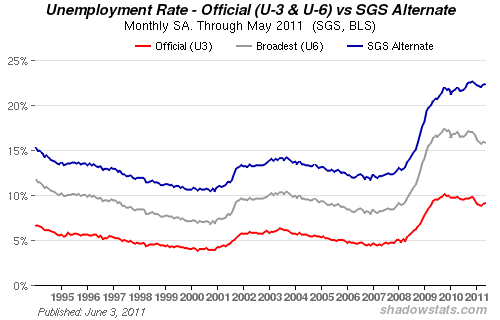
Chart #3 – Employment data
Source:Â Shadow Stats
The health of an economy is usually felt by households through having a job and having a decent wage. We’ve already shown that for over a decade the middle class has seen no wage growth. The above chart shows that the employment situation really hasn’t improved in the last few years even after the epic bailouts to the banking system but also the arbitrary notion that the recession ended in the summer of 2009. It only ended for a very small group in our society that overwhelmingly benefitted by targeted banking bailouts. In the end, the above unemployment chart speaks for itself and is also reflected in consumer confidence.
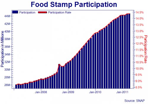
Chart #4 – Food stamp participation
Source:Â Zero Hedge, SNAP
We now have a record number of Americans receiving food stamps. This is also the largest percentage of Americans on food stamps ever. The chart above certainly does not look like any sort of recovery when you have 45,000,000+ Americans receiving food stamps. This is why you see the recent phenomenon of people waiting on the last day of the month at Wal-Mart eagerly waiting recharges to their debit cards so they can purchase food. The above chart reflects a trend that has gone in only one way. The data is behind one to two months so as of this writing, we now have more than 45 million Americans receiving food assistance. This shouldn’t surprise many of you given that 1 out of 3 Americans have no savings and the average per capita income is $25,000 for those who are actually working.
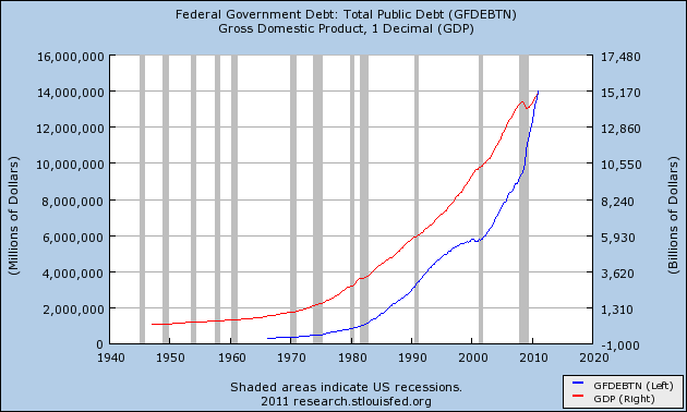
Chart #5 – GDP and public debt
Only recently have we crossed a dangerous threshold. We now have more public debt than we produce in GDP annually. Even though we are still the number one economy in the world, this is not a trend you want to see occurring. Any business that follows a similar trajectory is doomed for future failure. The banking bailouts have done very little in ameliorating the economy for working Americans so what really was their purpose? Like in any previous societies that were at their apex of cronyism including Rome, the Ottoman Empire, or even the United Kingdom when you start blowing money merely to protect a small select few internal conflict is bound to arise with the overall population. Much of the cost of extremely expensive wars are not even reflected in the above data which makes it more disturbing.
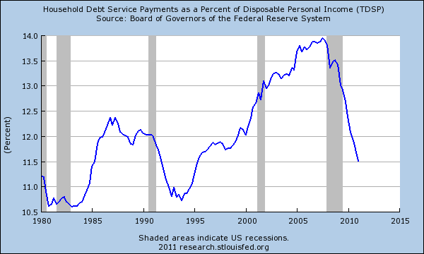
Chart #6 household debt
What is interesting however is the double standard applied in our financial economy. Households are clearly facing deleveraging through lower access of credit, foreclosures, and bankruptcies. This is to be expected after a decade long glut in fantasy spending. Yet it takes two to tango. If we look at the banking sector profits and their total debt we see no similar deleveraging. In fact, the bailouts simply came in to replace any lost profits that may have occurred through deleveraging. The above chart shows the household deleveraging rather clearly. What is more impactful is that this is also happening at time when incomes are stagnant so the hit is even more dramatic than the above chart is reflecting.
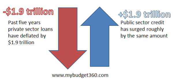
Chart #7 – credit market data
Households have seen a draining of $1.9 trillion in the credit markets since the crisis hit. Yet this amount of money has been injected from the government side. Where did all of this money go? Most of it went to the banking sector. There has been negligible improvement in the employment sector, household wages continue to go nowhere, and the security of middle class families continues to erode.
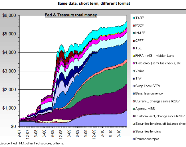
Chart #8 – Fed and U.S. Treasury funds
Source:Â Now and Futures
The above chart shows contrary to what the Federal Reserve and U.S. Treasury are saying, we have a massive shadow bailouts occurring. This is an absolute banking bailout. Very little of this money has trickled down to the working and middle class. So what you have is a giant swindle occurring and this is likely to continue if nothing changes in the next few years. We’ve already had over a decade of favorable policies to the banking sector and nothing seems to have created momentum for change. The next decade will prove to be painful for the middle class so people need to be aware of what is going on and simply look at the data to see where the money is really flowing.
If you enjoyed this post click here to subscribe to a complete feed and stay up to date with today’s challenging market!4 Comments on this post
Trackbacks
-
Dave Falke said:
Is it possible that capitalism has a life span ?
July 7th, 2011 at 2:43 pm -
Donnie said:
Fraud, and panoply of the seven deadly sins running wild on Wall Street and no one’s in jail? Many say we Americans are asleep at the switch…or just don’t care. Sad.
July 8th, 2011 at 5:00 am -
ordaj said:
I think we need a serious rethink in this country. We shoveled a few trillion to the banks to bail them out. A few trillion for two wars that went to defense-related mega-corporations. A trillion to rich people in this country via tax cuts. Trillions to multinational corporations that pay no or little taxes and yet receive no-bid contracts from government. Now, consumer credit card debt stands at about a trillion and outstanding student loan is also at about a trillion. I think we should shovel money at these two burdens and relieve the people for once. That will immediately boost the economy.
In ancient times, they used to have a Jubilee every 50 or so years where all public debts were forgiven. That’s because throughout history, the “elites” take advantage of the system and game it to their benefit until such a day comes when the whole thing collapses. The rich at some point have to take a loss and stop passing it on to the citizens. It’s either take a monetary loss or face revolution. They will lose something at some point, their money or their heads?
July 8th, 2011 at 10:15 am -
NOTaREALmerican said:
The 1.9 T “exchange” is an interesting point.
Good site. I read it all the time.
July 8th, 2011 at 4:11 pm
 If you enjoyed this post click here to subscribe to a complete feed and stay up to date with today’s challenging market!